

CRM data decay runs about 1% a month, not the 30% a year everyone quotes. What the measured numbers mean for how often you refresh.
Key takeaways
Measured decay among US sales leaders at VP and C-suite level runs at about 1% a month, or 12.25% a year. That is one cohort, not a universal rate. The 30% annual figure the industry repeats has no primary source anyone can produce.
Decay is uneven. UK sales leaders changed roles at 1.75 times the US rate. Marketing leaders churn faster than engineering leaders. A single refresh schedule across territories is wrong in at least one of them.
Seniority makes no difference, which contradicts what most teams assume.
A recent refresh date is weaker evidence than it looks, because the newest changes are the ones least likely to have been detected yet.
Your own rate is measurable in about an hour with 100 records and a spreadsheet.
The short answer
Among US sales leaders, where somebody has actually gone and measured it, contact records go out of date at roughly 1% a month. Not the 30% a year you have read in a dozen vendor blogs. The measured annual figure for that group sits at 12.25%.
Your own rate will differ, and that is the more useful half of this. The decay is not spread evenly. It concentrates by country and by job function, so a list averaging 12% wrong can be 21% wrong in one territory and 10% wrong in another, while your refresh schedule treats both the same.
This matters because the failure is silent. Nothing breaks. No error message appears. The campaign just underperforms, and somebody blames the message.
Where the 30% figure came from
Nowhere anybody can point to.
In September 2026, Lusha set out to find the source of the 30% annual decay rate that appears across vendor blogs, sales decks, and pitch materials throughout the B2B data category. They had cited it themselves. They could not find an original study behind it, reporting that the figure appears without primary attribution wherever it is repeated, each source citing another source citing another.
There is one figure here with a traceable origin. HubSpot's Database Decay Simulation states that email marketing databases degrade by about 22.5% a year, citing MarketingSherpa research that measures 2.1% per month. You can go and read that one, which already puts it ahead of most numbers in this category.
Two things about it are worth knowing before anyone quotes it at you. The page cites reports from 2013 and 2014, so the measurement is over a decade old. And it describes email marketing databases, not job changes among senior buyers. It is a real figure attached to a different question.
Numbers above 30% are harder to pin down. A 70.3% annual rate circulates widely, attributed inconsistently, including to a 2015 vendor data sheet crediting a source we could not verify. No primary study behind it that we could establish, so we are not using it.
We are dwelling on this because it is the practical part. If you have ever budgeted a data cleanup, argued for an enrichment tool, or set a refresh cadence, you probably did it against a number nobody can source.
The number someone actually measured
Lusha measured job changes across its own contact database instead, and published the method alongside the result. Among US sales leaders at the VP and C-suite level, a cohort of 140,284 contacts, 12.25% changed roles over twelve months and 25.67% over twenty-four months.
Both windows agree at just over 1% per month, which is what makes the annual figure credible rather than an artifact of where the window was drawn.
They also re-ran the whole thing four weeks later. The 24-month rate moved from 25.7% to 25.67%, a change of 0.03 percentage points across 140,000 people. A number that survives being re-measured is a rate. A number published once is a claim.
Their reading of the discrepancy is the interesting bit: 25.67% over two years is close enough to 30% that the industry figure is probably roughly right and simply attached to the wrong period. An annual rate that is actually a two-year rate. Everyone has been budgeting for twice the decay they have.
Two honest caveats, both of which Lusha states themselves. This counts only employment changes, so title changes within the same company, phone number changes, and email format migrations are not included, which means the true rate at which records go wrong is higher than 12.25%. And they measured detected changes, so every figure is a floor rather than a ceiling.
One more thing worth saying plainly. Lusha sells contact data, so they had every commercial reason to keep quoting the scarier number. They published a smaller one and corrected their own previous pages. That does not make them neutral, but a company publishing a figure against its own interest, with the method attached, has earned more trust than one publishing a bigger figure with nothing attached.
Decay is not evenly spread
Here is the part that changes what you do on Monday.
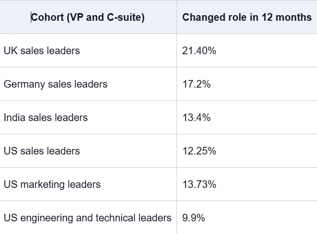
A UK sales list goes out of date roughly 1.75 times faster than an equivalent US one. Run the same quarterly refresh across both, and your UK data is meaningfully worse at every point in the cycle, and nothing in your process would ever tell you.
The size objection does not hold, either. The UK and Germany cohorts are almost identical, with 4,214 and 4,204 contacts, and return rates that are four points apart. If the regional variation were an artifact of how much data was held per country, two cohorts the same size would not diverge like that.
Function matters too, less dramatically. Marketing leaders changed roles at about 1.4 times the engineering rate. If you sell to CMOs, your list rots faster than if you sell to CTOs, and a blended refresh policy over-serves one and under-serves the other.
The ratios were the stable part. When the absolute rates drifted between the two runs, the UK-to-US gap held at 1.75x, and the marketing-to-sales gap held at 1.12x. So cadence built on the relationship between your segments survives the headline number moving around underneath it.
The thing nobody tests: seniority
Almost everyone assumes senior contacts behave differently. Either they are more stable because they are settled, or less stable because they get poached.
Neither. US sales VPs came in at 12.6%, C-suite at 12.4%. Two tenths of a percentage point apart.
We are including a null result because it kills a rule of thumb that quietly shapes a lot of refresh policies. If you have been prioritizing verification on your senior contacts on the assumption they move more, you have been spending effort on the wrong axis. Country first, function second, seniority not at all.
A recent refresh date proves less than you think
This is the finding we would put on a wall.
Measured over three months, the rate drops to 0.50% per month, half the longer-run figure. Job changes do not slow down in recent months, so that gap is detection lag. A change takes time to surface in any dataset that observes employment rather than being told about it.
Which means a record that looks current can already be wrong, and the freshest changes are precisely the ones least likely to have been caught.
If you have been treating "last enriched 30 days ago" as proof of accuracy, it is not. It is proof that somebody ran a process 30 days ago. For anything high-stakes, a check at the moment of use beats a scheduled refresh, because the schedule cannot see what the data source has not yet detected.
Measure your own rate in an hour
Published benchmarks are a sanity check. Your own number is the one worth acting on, and it is not hard to produce.
Export 100 contacts you have not touched in twelve months. Take them at random rather than picking your favorites, or you will flatter yourself.
For each one, open LinkedIn and check two things: is this person still at that company, and do they still hold that title?
Mark each record as still accurate, wrong company, or wrong title.
Count. The percentage that failed either check is your twelve-month decay rate.
Now do the interesting version. Split the same 100 by territory and by job function, and calculate the rate separately for each group. That split is what tells you where your refresh schedule is failing.
An hour of work, and you end up with something no vendor benchmark can give you: the rate for your list, your markets, your buyers. If your split comes back close to uniform, keep one schedule. If one territory is running at double the rate of another, you have found a fixable problem that was invisible yesterday.
Worth noting what this method misses. Checking against LinkedIn catches job and title changes, not dead email addresses or changed phone numbers, so your real number is somewhat worse than what you will measure. Same limitation the published research has.
The record you should stop deleting
One flip worth making before you clean anything.
When a contact turns up at a new company, most teams treat it as a dead record and delete it. That is backward. Somebody who knows your business, arriving in a new role with a fresh mandate and usually a budget to prove something with, is one of the warmest openings you will ever get. New executives change vendors. That is most of what a new executive does in the first six months.
So the audit above produces two outputs, not one. A decay rate, and a list of people who just moved. The second one is worth more than the first.
Whether those people are worth pursuing is a different question from whether their record is accurate. Sorting the genuinely qualified from the merely reachable is the step after this one, and it is where most of the wasted effort actually lives.
Questions people ask
What is CRM data decay?
CRM data decay is the rate at which contact records become inaccurate over time, primarily due to people changing jobs or job titles. Measured among US sales leaders, it runs at about 1% per month, or 12.25% over twelve months. Email and phone changes push the real figure higher.
How fast does B2B contact data really decay?
Lusha measured 12.25% of US sales leaders changing roles over twelve months and 25.67% over twenty-four months, across a cohort of 140,284 contacts. That works out to roughly 1% a month, and the rate held steady when they re-ran the measurement four weeks later.
Is the 30% annual data decay figure accurate?
No primary source for it has been produced. The measured evidence suggests it is roughly correct as a two-year rate rather than an annual one, which means teams quoting it annually are planning for about twice the decay they actually face.
How often should I refresh my CRM data?
Set the cadence by territory first, since region varied more than any other factor measured. A US sales list is around 12% wrong at twelve months, while a UK list reaches that point in roughly seven. For lists going into a campaign, verify at send time rather than relying on a schedule.
Do senior contacts change jobs more often?
No. US sales VPs and C-suite contacts changed roles at 12.6% and 12.4% respectively, a gap of two tenths of a percentage point. Seniority is not a useful input when planning how often to verify records. Country and job function are.
Does a recent enrichment date mean my data is accurate?
Less than you would expect. Measured over three months, detected decay runs at half the longer-term rate, indicating a lag between a job change and any dataset noticing. A record refreshed last month can already be wrong.
What causes CRM data to decay?
Mostly people changing jobs and job titles, which is what the measured figures above capture. Records also go wrong due to company acquisitions, email domain migrations, phone number changes, and internal role renames. Only the first category has been measured well, so published rates understate the total.
Which CRM fields go stale fastest?
Nobody has published a field-level measurement with an accompanying method that we could verify. Vendors quote figures for email and phone decay, but those trace back to the same unsourced pool as the 30% claim. Treat field-level numbers as unproven until someone shows their working.
Does CRM data decay at the same rate everywhere?
No, and this is the most actionable finding. UK sales leaders changed roles at 21.40% over twelve months against 12.25% in the US, a gap of 1.75 times. Job function matters too. A single global refresh schedule is therefore wrong in at least one territory.
What to do with this
Stop budgeting against a number nobody can source. Spend an hour measuring your own, split by territory and function, and set your cadence against the split rather than the average.
Then look at the people who moved. That list is not damage. It is the most useful thing the audit produces, and most teams throw it away because it appears in a column labeled "invalid".
If the audit points at how leads are captured, routed, and kept current across your systems rather than on the data itself, that is the part we work on. Send us your split, and we will tell you what we would fix first.