
You paid for a redesign. The new site looks sharper than the old one; the team signed off, and everyone was pleased. Then the enquiries stayed flat. Maybe they dropped.
The most expensive website redesign mistakes are almost never the visual ones. They happen when a business redesigns its pages without redesigning the buying journey underneath them. A better-looking site does not fix a lead problem. It usually hides it behind nicer photography. So before you commission another one, or write this one off, it is worth knowing what actually drives enquiries and what quietly kills them.
Key takeaways
A redesign that changes how the site looks but not how it sells will not change your results.
The Google and Deloitte Milliseconds Make Millions study found measurable conversion gains from performance changes alone, with no visual redesign involved. Design is not the lever most people think it is.
The recurring failure is redesigning pages instead of the journey a buyer takes from first click to enquiry.
Use the CLEAR framework (Clarity, Lead path, Evidence, Action, Results) to test any redesign plan before approval.
Measure against a pre-redesign baseline, or you will not know whether the new site helped or hurt.
Contents
Why your redesign looked great and changed nothing
What a bad redesign actually costs
The mistake underneath all the others
The CLEAR framework
A website redesign checklist to use before you approve anything
Common website redesign mistakes
How to know whether your redesign worked
FAQs
Why your redesign looked great and changed nothing
Most redesign projects start with the wrong question. Someone says the site looks dated, a proposal comes back, and the whole project gets scoped around appearance: new brand, new layout, better photography, a cleaner menu. All reasonable. None of it is why people fill in your contact form.
A visitor deciding whether to enquire is answering a different set of questions. Am I in the right place? Can these people solve my specific problem? Do I trust them? What happens if I reach out? A redesign scoped around aesthetics can sail through without addressing any of those, which is how a business ends up with a site that photographs well and converts worse than the one it replaced.
This is the core reason website redesigns fail. The project optimised the interface and left the buying journey exactly where it was, or quietly broke it.
What a bad redesign actually costs
The cost shows up in two places: lost momentum on the pages that were already working, and no improvement on the pages that were not. The evidence that small, non-visual changes drive real revenue is strong. In the Google and Deloitte Milliseconds Make Millions study, researchers analysed more than 30 million user sessions across 37 retail, travel, luxury, and lead generation brands. A 0.1 second improvement in mobile load time lifted retail conversions by 8.4% and travel conversions by 10.1%. On lead generation pages specifically, the bounce rate improved by 8.3%. The detail that matters most for this discussion: no visual redesigns happened on any of the sites during the study. Speed alone moved the numbers.
Read that the other way around and it is a warning. If a fractional speed change can move conversions by 8 to 10 percent, a redesign that ships a slower, heavier site can quietly cost you the same amount in the opposite direction. Many do. New design frameworks, video backgrounds, and uncompressed images routinely push a page that loaded in two seconds up to five or six.
When BMW rebuilt its mobile site, the team named speed as the first, second, and third priority before anything else. That is a company treating the website as a performance system rather than a brochure. That is the mindset most redesign briefs are missing.
The mistake underneath all the others
Here is the distinction that separates a redesign that generates leads from one that does not.
Redesigning the page means changing what the site looks like. New visuals, new layout, new copy tone.
Redesigning the journey means changing what the site does. The route a visitor takes from landing on a page with a problem to sending you an enquiry with confidence.
Almost every list of website redesign mistakes you will find focuses on the first column below. The real problem lives in the second.
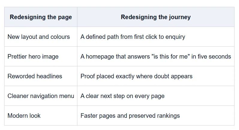
You can do everything in the left column and still lose leads. You cannot fix a lead problem without the right column.
The CLEAR framework
Use this to pressure-test a redesign before you approve it, and to diagnose one that already disappointed you. Every letter is a part of the buying journey a redesign must serve. Miss one and the enquiries leak out there.
C is for Clarity. Within five seconds, can a first-time visitor tell what you do, who you do it for, and why it is worth their time? Redesigns often trade a plain, clear message for a stylish, vague one. Clever taglines lose to specific ones.
L is for Lead path. Is there a deliberate route from a visitor's problem to your enquiry form, or just a set of nicely designed pages sitting next to each other? Map the path a buyer should take, then check the new design actually builds it.
E is for Evidence. Trust is where redesigns bleed quietly. When you replace concrete proof (named results, client logos, case detail, reviews) with brand language and stock imagery, you remove the reasons a stranger had to believe you. Put proof next to the point where doubt shows up.
A is for Action. On every important page, what is the next step, and how much friction sits in front of it? A buried contact link or a fourteen-field form will undo good work everywhere else. This is where website redesign conversion is won or lost.
R is for Results. Can you measure whether the new site works, against how the old one performed? If you cannot, you are redesigning blind and you will not catch a problem until a quarter of pipeline is already gone.
A redesign that passes CLEAR is one where the buying journey is stronger than it was. A redesign that only refreshes the look will fail at least one of these, usually Evidence and Action.
A website redesign checklist to use before you approve anything
Run any redesign plan through these questions before work starts. If the answer to several is no, you are scoping an aesthetic project and expecting a commercial result.
Clarity
Can a stranger describe what we do after five seconds on the homepage?
Does each core page name the specific problem it solves?
Lead path
Have we mapped the exact route from landing page to enquiry?
Does every page have an obvious next step toward contact?
Evidence
Are our strongest proof points kept, or are they being replaced with brand language?
Does proof appear on the pages where buyers hesitate, not just an "About" page?
Action
Is the primary call to action visible without scrolling on key pages?
Have we cut every non-essential field from the enquiry form?
Results
Have we recorded a baseline of current traffic, rankings, and enquiries before launch?
Do we have a redirect map for every existing URL that has traffic or rankings?
This checklist is the difference between website redesign planning that protects your pipeline and a project that gambles with it.
Common website redesign mistakes
These are the specific errors that turn a redesign into a lead problem. The first few are strategic. The last few are technical, and they are the ones that erase rankings overnight.
Scoping the project around looks, not the journey. The brief talks about brand and layout and never mentions the enquiry path. Everything downstream inherits that gap.
Replacing proof with polish. Specific results and client detail get swapped for cleaner design and vaguer copy. Credibility drops even though the site looks better.
Hiding the call to action. A minimalist design pushes the contact step below the fold or behind an extra click. Fewer people take it.
Rewriting pages that already rank. Copywriters refresh the language on a page that was pulling in leads and strip out the terms it ranked for. This is one of the most common causes of a website redesign not generating leads.
Changing URLs without redirects. Every old URL that had traffic needs a permanent 301 redirect to its new home. Miss them, and Google treats your pages as gone.
Launching with a noindex tag still live. Developers add a noindex tag during the build to keep the staging site out of search, then forget to remove it at launch. The whole site tells Google to stay away. Check for it in the page source before and after go-live.
Ignoring speed. A heavier, slower site loses conversions on its own, as the Google and Deloitte data shows. Test load times on mobile before you sign off.
For a deeper walkthrough of the security and technical checks a new build should pass, see our guide on AI website security. For how search engines increasingly read and rank pages, our breakdown of the Google AI landing page patent is worth reading before you finalise structure.
How to know whether your redesign worked
You cannot judge a redesign on how it feels. Judge it against a baseline.
Before launch, record three things: your organic traffic and top-performing pages, your keyword rankings, and your enquiry volume over the previous 90 days.
After launch, watch the same three. Some ranking fluctuation in the first four to eight weeks is normal while search engines reprocess the site. What you are watching for is a drop that does not recover, or enquiries falling while traffic holds steady. The second pattern points at the journey, not at search: people are arriving and leaving without acting.
This is also how you calculate website redesign ROI honestly. The return is not "the site looks better." It is the change in qualified enquiries against what the project cost. If you never set the baseline, you can never make that case to anyone.
FAQs
When should a business redesign its website?
Redesign when the site is actively costing you: leads are falling, the design undermines trust with the buyers you want, or the platform blocks changes you need. Age alone is a weak reason. A three-year-old site that still converts does not need rebuilding.
Does redesigning a website improve SEO?
It can go either way. A redesign that preserves URLs, redirects, page speed, and the content that already ranks can improve SEO. A redesign that changes URLs without redirects, rewrites ranked pages, or ships a slower site usually damages it. The outcome depends on planning, not on the design itself.
Why didn't my new website increase leads?
Most often because the redesign changed how the site looked without changing the buying journey. If proof got replaced with brand language, the call to action got buried, or ranked pages were rewritten, leads fall even when the site looks better. Diagnose it with the CLEAR framework above.
Should I redesign or optimise my existing website?
If the structure and platform are sound and the problem is specific (a weak homepage, a hidden call to action, slow pages), targeted optimisation is faster, cheaper, and lower risk than a full redesign. Redesign when the foundation itself is holding you back, not before.
How long does it take to see results after a redesign?
Expect four to eight weeks of ranking fluctuation while search engines reprocess the site. Meaningful data on leads and conversions usually takes 60 to 90 days. If key metrics are still down after two months against your baseline, treat it as a problem to fix, not a phase to wait out.
Before you approve your next redesign
If your last redesign disappointed you, or you are about to commission one, the useful move is not to argue about layouts. It is to map the buying journey first and make the design serve it. That is the work most projects skip, and it is where the leads are.
A Think Big Digital Website Strategy Session does exactly that. We look at your current site against the CLEAR framework, show you where the journey breaks down, and tell you whether you need a redesign or just a few targeted fixes. Book a Website Strategy Session and start from strategy, not from a mockup.